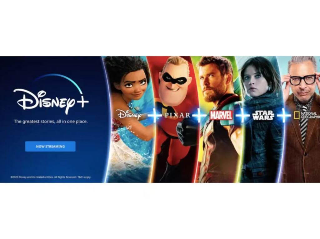
This time, I analyzed an online banner digital advertisement of Disney+. Its picture is very intuitive: on the left is the brand logo of Disney+ and a value proposition, while on the right, Disney, Pixar, Marvel, Star Wars and National Geographic are arranged like a “content shelf”, and a prominent “+” connects them. At first glance, it looks like a “brand collage”, but in fact, behind it is a very clear conversion logic: using the collective advantages of content assets, it pushes users from “seeing” to “clicking/starting to watch”.
Strategy: It doesn’t sell a single show, but an “entry point to a content universe”
This advertisement doesn’t highlight a specific hit item. Instead, it puts the five content brands on the same picture, conveying a core promise: the best stories are all in one place. The advantage of this strategy is that it can simultaneously cover different groups of people – parents and children will be attracted by Disney/Pixar, action and hero-themed fans will be attracted by Marvel, sci-fi fans will be attracted by Star Wars, and those who like documentaries will notice National Geographic. In other words, it is using “multi-interest coverage” to expand the potential subscriber base and turn the platform value into “one subscription, multiple satisfactions”.
Activation Mechanism: Emotional Trigger + Value Amplification + Low Friction Action
The most crucial activation mechanism of this banner can be summarized as three-step links: The first step is emotional trigger: familiar characters and IP’s inherent memory points can quickly evoke the audience’s interest, emotional resonance and fan identity recognition, making attention stop first. The second step is value amplification: the copy emphasizes “all in one place”, essentially solving the user’s choice anxiety – there is no need to worry about what to watch, nor to search for resources everywhere. One platform can cover multiple content universes, thereby enhancing the perception of “very worth it”. The third step is action reduction: the CTA button “NOW STREAMING” simplifies the next step, reducing decision costs, and directly converting the “want to watch” impulse into “clicking in”.
Own Construction: Clear information hierarchy, visual language follows “logic”
From the structure, the advertisement divides the information into two parts: the left side is responsible for “clearly stating who I am, what I can offer, and what you should do next”, while the right side is responsible for “proving that I have a lot of content”. The large logo on the left builds trust, the slogan summarizes the value in one sentence, and the button gives a clear action; the right side uses vertical partitions to modularize different brand modules, and the middle “+” becomes a visual language – it is not just a symbol, but also tells users: you are buying a complete content combination, not a single choice.
Position: Suitable for appearing in “scenes where users already want to entertain”
This type of banner advertisement is most suitable to be placed on entertainment-related websites, content information pages, around video platforms or social media information flows. The reason is simple: in these scenarios, users are already in the state of “wanting to watch something”, and the advertisement only needs to turn “wanting to watch” into “now watch”, with a shorter and smoother conversion path.
Overall, this Disney+ banner advertisement is very “platform-oriented”: it doesn’t persuade users with complex information, but quickly grabs attention with strong IPs, enhances attractiveness with “collective value”, and lowers the action threshold with clear CTA. It links together “emotion trigger – value commitment – low-friction action” to form a complete chain. Therefore, even a simple banner can effectively drive clicks and subscriptions.
James Chen
01/27/2026

Leave a comment