The brand website I will analyze is Apple’s Store homepage. I will observe how it organizes content, guides user behavior, and what actions it expects users to take from the perspectives of information architecture and user experience.
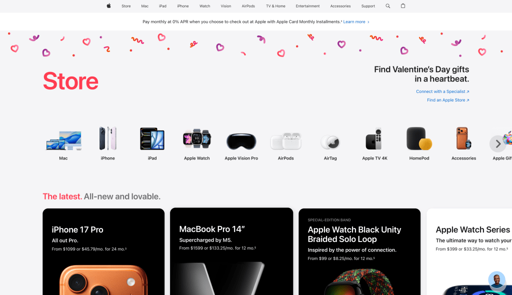
First, from the perspective of interface design, the most notable feature of this page is its “extremely strong visual hierarchy” and “moderate guidance”. The left side of the page uses a large font size of “Store” as the title, allowing users to quickly confirm their location and the nature of the page at a glance; on the right side, there is a holiday-themed slogan like “Find Valentine’s Day gifts in a heartbeat.” This brings users into a clear consumption scenario. The overall background has ample white space, with large spacing between elements, and a unified visual style, giving a simple, trustworthy, and low-pressure browsing experience. It does not use dense “buy now” buttons to create anxiety, but instead uses clear classification entrances and recommended content to allow users to naturally “scroll down”. Additionally, at the top of the page, there is information about installment payments/0% APR, which is a typical “lowering psychological barriers” design: before users click into specific products, concerns about “price pressure” and “payment methods” are addressed, thereby increasing the likelihood of subsequent clicks and purchases.
From the perspective of information design and information architecture, the structure of this page is very typical: organized hierarchically around “product lines”. The top navigation bar directly corresponds to Apple’s main product families, which is the most common and intuitive entry path for users. In the middle of the page, various product categories are presented in a row using icons and text. This “scannable” information design reduces reading costs and enables users to find their way in a very short time. Further down, the page enters the “thematic/curation-style recommendation” area, such as the “Latest” module, which uses cards to uniformly carry new products and key items. Each card typically contains the product name, brief selling points, and price or installment information. The advantage of the card design is consistent information structure, visually easy comparison, and more like a “store window”, effectively improving browsing efficiency and conversion rate. At the same time, the page also provides service entrances such as “Connect with a Specialist” and “Find an Apple Store”, indicating that its architecture is not only for “online ordering”, but also provides paths for the user journey of “consultation – comparison – in-store experience”.
Based on these observations, I believe that Apple’s main desired actions for users on this page are three: First, complete the first step of “browse – select category”, that is, enter a specific product line from the homepage; second, make a faster “select gift – purchase” decision in the holiday scenario; third, for users who are still hesitant, push them to “consult an expert” or “in-store”, using services and experience to reduce decision-making costs. In other words, it does not only pursue “immediate purchase”, but diverts users to different conversion paths: those who are ready directly buy, those who are not ready go to consultation or in-store.
Overall, the Apple Store homepage uses a very clear hierarchical structure, extremely high scanability, and the combination of “holiday scenario + product line classification + card recommendation”, allowing users to progress naturally from “seeing – understanding – choosing – acting”. Its UX reflects Apple’s consistent brand temperament: simple, orderly, and low pressure, but each step guides users closer to the core goal of “purchase or receive support”.
James Chen
02/10/2026

Leave a comment